
Boom and Crash: The drift, the spike, and what a spike does to your indicators
The drift is designed to balance the spike. Here's what that spike does to every windowed indicator on the chart.

Yazan Aleksandrs Popovs (Sasha) · Dealing Products Team Lead
29 Eylül 2026 · 6 dk okuma
Last week I argued that on Volatility Indices, most of the indicator menu is inert and Bollinger Bands are the one tool I'd put on every chart. This week I'm going to reverse almost all of that, because Boom and Crash Indices are a different animal, and the thing that makes them different is exactly the thing indicators are worst at handling.
Two indices, one design
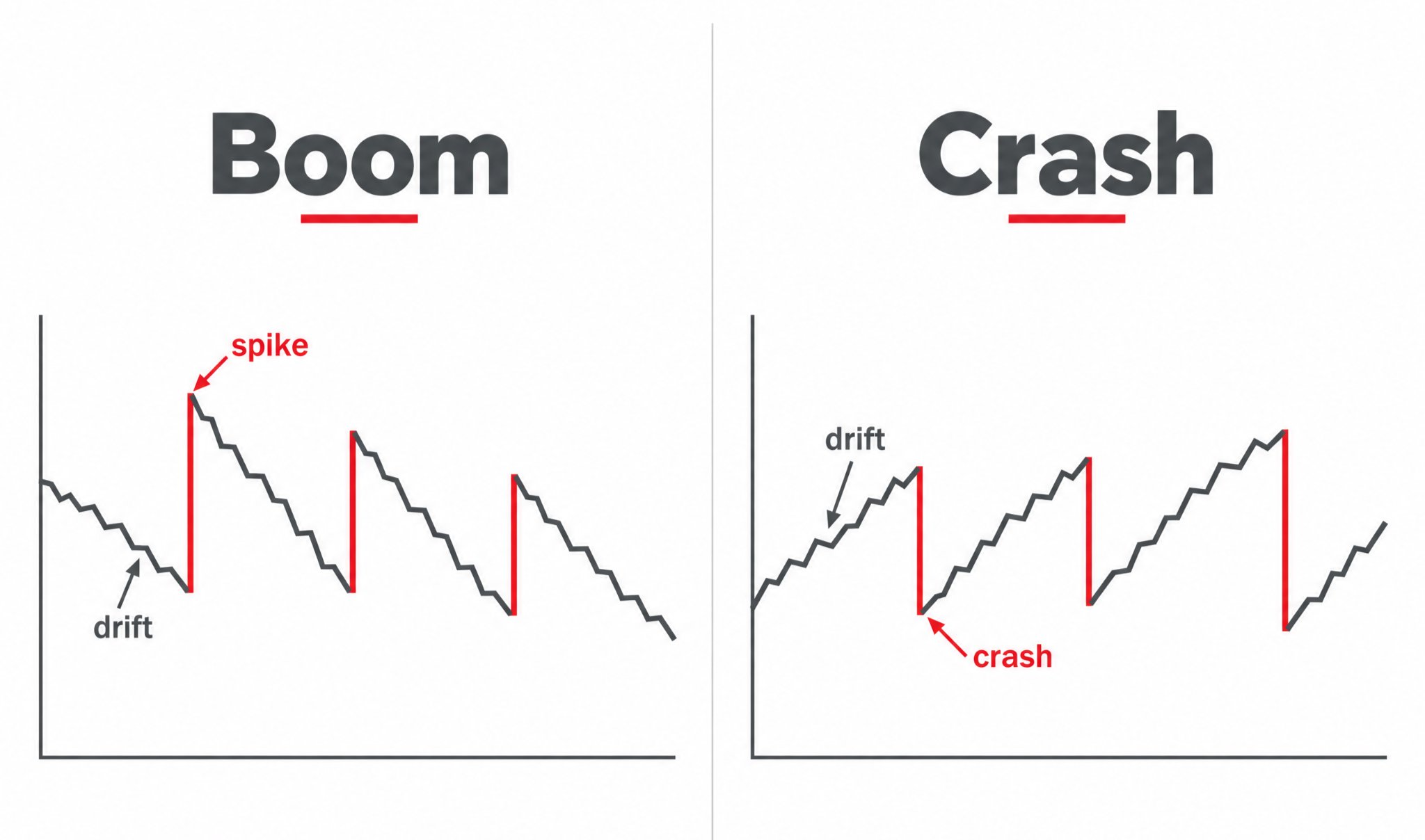
A Boom index drifts slowly downward and then, at random intervals, spikes sharply up. A Crash Index does the mirror image: it drifts slowly upward and then drops sharply. Call the spike what it is: a gap. Last week I said Derived Indices never gap, and for Volatility and Step Indices that holds.
Boom and Crash are the opposite case. The discontinuity is the product, and the name tells you how often to expect it. The number in the name is the average tick spacing between events. Boom 1000 spikes on average once every thousand ticks; Boom 300 roughly once every three hundred. "On average" is doing a lot of work in that sentence. The events are random. There is no schedule, and the gap between two spikes can be very short or very long.
I put Boom 1000 and Crash 1000 on one chart to look at them together, which I recommend doing at least once, because the symmetry is the whole lesson.
On the one-day range, the drift is texture and the spikes are vertical steps. On the one-month range you can count the events and see how irregular the spacing is. This is the point where most people's understanding of "every 1000 ticks" changes from a schedule to a probability.
The drift is construction, not information
Here's the first thing that trips up anyone coming from real markets.
Boom 1000 spends most of its time going down. If you put a moving average on it, the price sits below the average almost constantly. Moving Average Convergence Divergence (MACD) reads bearish. Average Directional Index (ADX) says there's a trend. Every trend-following tool on the menu tells you, with total confidence, that Boom 1000 is in a downtrend.
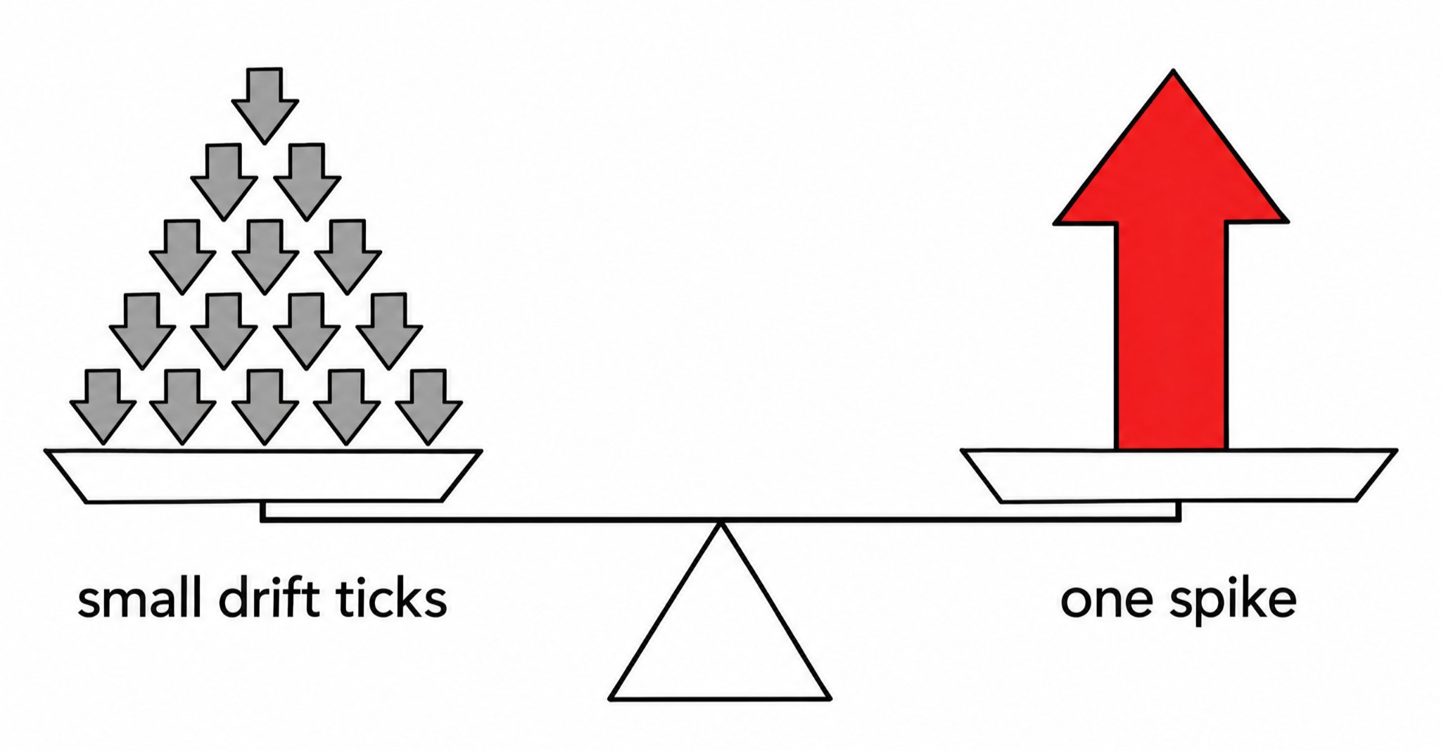
It is. But the downtrend isn't information about anything. It's the instrument's design. The index drifts down between spikes so that, once the upward spikes are included, the whole thing balances. The drift is the price of the spike. A trend indicator reading "down" on Boom is like a thermometer reading "warm" in an oven: accurate, and telling you nothing you didn't build in yourself.
On Volatility Indices I said trend tools were educational because there was no trend to find. On Boom and Crash they're educational for the opposite reason: there is a trend, it's permanent, and following it walks you straight into the spike.
What a spike does to a windowed indicator
This is the part that flips last week's verdicts.
Almost every indicator on the chart looks back over a window. Bollinger Bands use the last 20 bars. Average True Range (ATR) uses 14. A 50-period moving average uses 50. Relative Strength Index (RSI) uses 14. On a Volatility Index that window is full of ordinary random steps, and the indicator behaves.
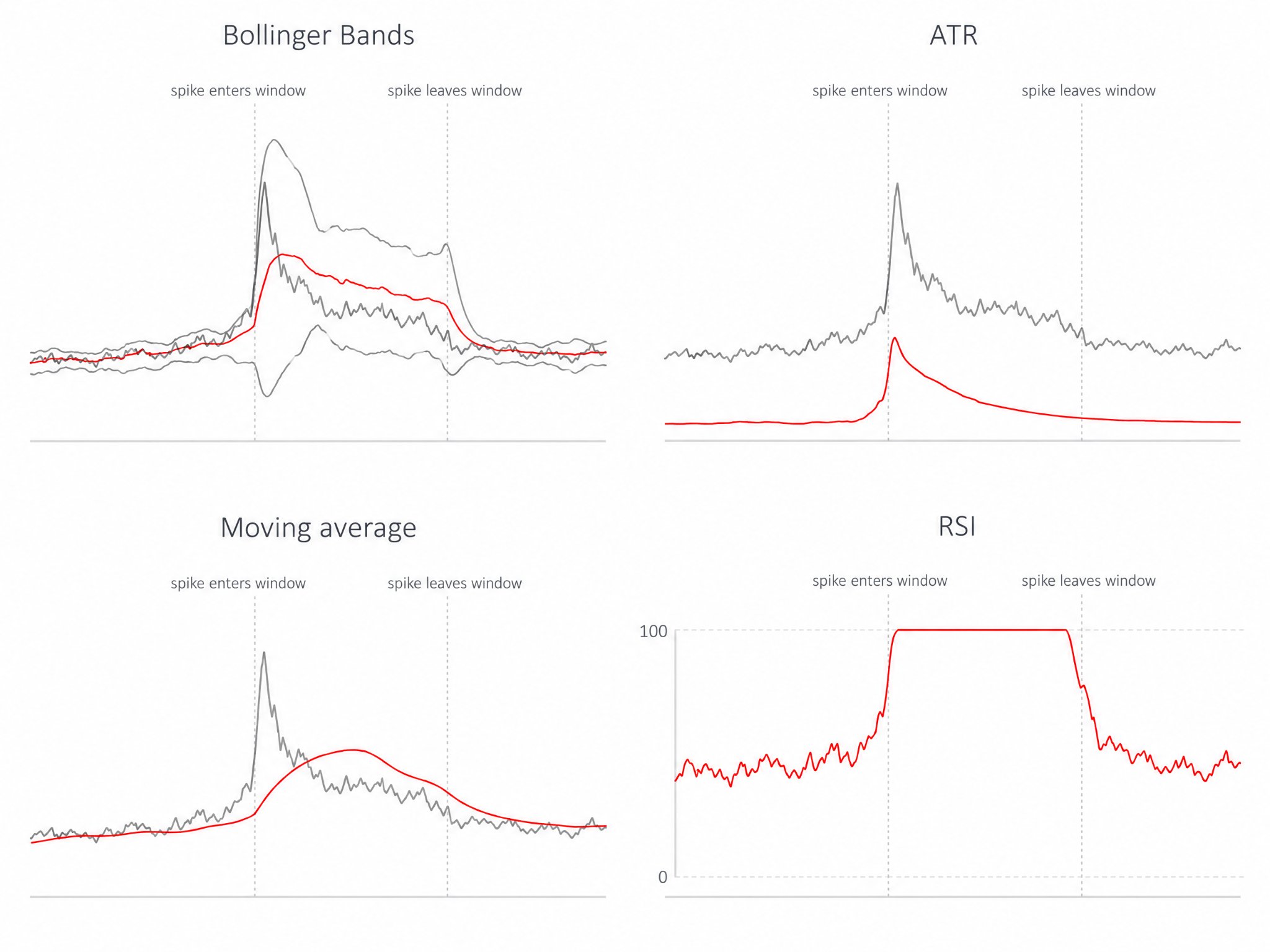
Then a spike lands. On Boom 1000 that's a move that dwarfs everything around it, and for the next 20, 14 or 50 bars, depending on the indicator, that one event sits inside the window and dominates the maths.
What I saw, indicator by indicator:
- Bollinger Bands, my favourite on Volatility Indices, blow their width out the moment the spike enters the 20-bar window and stay wide until it leaves. For those 20 bars the bands are describing one tick from twenty bars ago, not the current market. Then the spike drops out of the window and the bands snap back. If you're reading a "squeeze" at that moment, you're reading an artefact.
- ATR does the same in a single line: it jumps on the spike and decays over the next 14 bars. That decay curve is not volatility falling. It's the spike ageing out of the average.
- Moving averages get pulled towards the spike and stay displaced for a full period. On Boom, that means the average sits above the price for a while after every spike, which looks like a pullback setup and isn't one.
- RSI gets pinned. A spike on Boom sends RSI towards the top of its range and holds it there for several bars while the event works through the 14-bar window. During that time "overbought" means "a spike happened recently", nothing more.
None of this is a bug. It's what averaging does with an outlier. The problem is that on Boom and Crash the outlier is the instrument's defining feature, arriving on purpose, forever.
Timeframes make it worse, quietly
One more trap. On a one-minute chart a spike is a spike: a huge candle you can't miss. On a one-hour chart the same spike is a long wick on an otherwise ordinary candle, and on a daily chart it can vanish into the body entirely. The indicator still sees it, because indicators use highs and lows. You don't.
That means a higher-timeframe chart of Boom looks calmer than the instrument is, while the indicators on that chart are still being distorted by events you can no longer see. If you chart Boom or Crash, I'd stay on low timeframes where the spikes are visible, and I'd avoid Renko or any chart type that filters "noise", because on these indices the noise is the product.
What's left
Between events, Boom and Crash behave like a drifting random walk, and RSI on the between-event stretches is about the only oscillator I'd trust to mean what it says. Bollinger Bands are fine as long as you know when the last spike was and mentally discount the twenty bars after it. Volume and session tools have nothing to measure here, same as last week. Gap tools are the interesting exception: they finally have something to detect, but a "gap fill" on Boom is not a fill. After a spike the index goes back to drifting down at its usual pace, so the gap closes slowly and by construction, not because the market changed its mind. Trend tools describe the design.
So the honest summary is uncomfortable. On Volatility Indices, most indicators are inert and a few are excellent. On Boom and Crash, the few that were excellent become actively misleading for a full window after every event, and the events are the point of the instrument.
If that sounds like an argument against charting Boom and Crash at all, it isn't. It's an argument for charting them with the spike in mind: knowing when the last one was, knowing which of your indicators is still digesting it, and reading everything else in that light. The instrument tells you its own rules in its name. Most indicators weren't listening.
This content is not intended for EU residents. The performance figures quoted refer to the past, and past performance is not a guarantee of future performance or a reliable guide to future performance.